Contents
0%Hey!
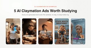
These are the four best AI-made Zack D. Films-style ads I have found. Instead of a surface tour, we transcribed each one word for word, read the script the way a direct-response copywriter would, and went through the footage frame by frame to find where the execution holds and where it cracks.
Watch each ad first, then read its breakdown. If you want the format itself, the pillars are in the format post, and the video builds a complete ad with them.
1. The turmeric ad (BioRoot Labs)

The BioRoot script anatomy: assumption-break hook, agitate the loss, mechanism ladder, tap-below CTA
The script, read as a copywriter. The hook is an assumption break aimed at people who already buy turmeric: "You swallow a turmeric capsule and assume your body absorbs it." That "assume" converts the viewer's current behavior into an open loop, and the visual pays it off instantly, the mascot swallows on the word "swallow" and the camera is inside his torso by second two.
The mechanism section is the best-built stretch in any of these four ads. Three problems, each answered by exactly one ingredient: absorption answered by black pepper, dilution answered by Curcumin 95, dispersion answered by MCT oil. Every ingredient earns its reason to exist before the stack is listed, and the objection handling is professional: "Not by shutting your body's natural signals down" kills the NSAID comparison without ever naming ibuprofen.
Then the close forgets to sell. Zero proof of any kind, no offer, no guarantee, no urgency, and the lowest-commitment CTA available, "Tap below to learn more," delivered once in one second. The script even leaves the niche's most famous number unused: the piperine and curcumin pairing has a roughly 2000 percent bioavailability claim attached to it in the literature, and this ad settles for "helps increase." The first 87 seconds argue like a sales letter. The last 11 forget they are an ad.
Where the visuals crack.

The MCT caption playing over a press crushing ginger roots
From 0:39 to 0:49 the visuals run exactly one ingredient behind the script. The "MCT" caption plays over ginger being crushed, "GINGER" plays over the bee propolis honeycomb, "BEE" plays over capsule assembly. A half-watching viewer learns the wrong mechanism for every ingredient in the stack, and the confident keyword captions make it worse by labelling the wrong footage.

The final pack shot: Block Popger Eorout, Bee Propelis, 50 Veyolorior Capeties
And the single most-viewed asset in the ad, the bottle close-up that holds the screen for the final ten seconds, reads "Block Popger Eorout," "Bee Propelis," and "50 Veyolorior Capeties." The end card behind it duplicates "HEALTHY INFLAMMATORY RESPONSE" in two boxes and illustrates antioxidant support with the same grey virus the ad spent ten seconds establishing as the villain. Every generation flaw in this ad is concentrated at the decision moment, which is why the format's rule is that all type happens in the editor.

The split-screen comparison: clumped powder blocked at the cell wall versus gold particles dispersing through
Credit where due: the split-screen at 1:15 is the best three seconds of the ad. One backdrop, one variable changed, colour-coded verdict. It compresses the entire 75 second mechanism argument into a single readable image, which is exactly what a demonstration shot is for.
2. The cat chew ad (Purrick)

The Purrick script anatomy: persona hook with a number gap, myth kill, causal chain, guarantee with no ask
The script, read as a copywriter. 173 words in 53 seconds with no wasted sentence. The hook fuses an exotic authority persona to a number gap: "I'm a Japanese cat keeper... our cats live past 25. Most cats in America don't make it to 12." The gap does the scroll-stopping, and the triple myth kill that follows ("It is not the food, it is not the breed, it is not their genes") disqualifies every explanation the viewer already holds.
The agitation is a textbook causal chain, four short physical links: plaque beneath the gum line, bacteria enter the bloodstream, strain on the kidneys and heart, "It steals years from their life." Theft framing makes doing nothing feel like being robbed, which is what this category needs, because no cat owner wakes up worried about plaque.
The risk reversal is the best offer line in any of the four: "If your cat doesn't love it, you don't pay." It targets the buyer's true fear, the cat ignoring the expensive stick, not product inefficacy. And then everything around it is missing. The brand is spoken once, appears on screen only as a lowercase caption, gets no pack shot, no logo, no end card, and no CTA verb of any kind before the video hard-cuts to black. The last 8 seconds sell the guarantee of a product the viewer cannot name, spell, or find. The in-world narrator explains the miss: a village elder cannot say "tap below," and the ad never breaks format to let anyone else say it. The fix costs five seconds, hold the persona for 45 and close on a branded end card.
Where the visuals crack.

The 95 percent claim over a coin grid where roughly a quarter of the coins have no checkmark
The sharpest find in all four ads: the proof graphic disproves its own claim on screen. Under the sparkling golden "95%", at least 5 of the 18 fully visible cat-coins have no checkmark, a visible tally of roughly 72 percent. The generator understood "grid of coins, mostly checked" but it cannot count, and nobody QA'd the math inside the image. This is the exact class of error a human motion designer never makes and a prompt never catches unless you look.

The guarantee scene: a disembodied human hand in a blue sleeve handing coins to the tiny narrator
The best-written line of the script plays over the most broken visuals: the money-back shot features a disembodied photoreal human hand in a blue suit sleeve, in a world where nobody wears blue or has human hands, while the narrator has shrunk to desk-toy scale, his third scale relationship in 53 seconds.

The macro shot inside the cat's mouth: rendered tartar at the gum line with a yellow arrow
And the win: the macro plaque mouth at 0:29 and its payoff twin, plaque flakes visibly shearing off mid-chew at 0:39, are shots live action cannot get and CGI agencies charge real money for. Those two shots ARE the mechanism argument, and they are the strongest execution in the ad. The garbled counterpoint is painful though, the giant demonstration cat head in this teeth ad has doubled rows of fangs pointing both up and down.
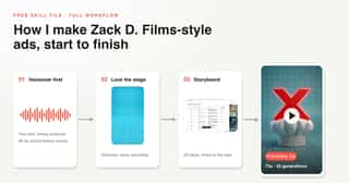
Everything these ads get right is packaged as rules, with the five stage plates, the narrator voice, and the actual music track included. Download it free.
3. The compression sock ad (VIASOX)

The VIASOX script anatomy: symptom-mirror hook, mechanism-first agitation, mirrored resolution, search CTA
The script, read as a copywriter. The first 45 seconds are the best writing of the four. The hook is a symptom mirror with validation: "If your legs have felt like they're being inflated like a balloon lately, it's not just in your head." That second clause speaks straight to someone whose pain has been dismissed, which buys trust before anything is sold.
The engine of the ad is a mirrored mechanism. The problem is taught first in stagnation language, "Blood slows. It pools. It sits there," and the resolution inverts it word for word, "Blood moves. The pooling stops." The payoff is felt as the exact undoing of the problem. In between sits a time-anchored symptom ladder, "Heavy legs by morning. Aching by noon. Shoes that don't fit by evening," each line checkable against the viewer's own day, and a fear escalation that never makes a claim: "your heart working harder all day, trying to do what the valves no longer can." The glowing strained-heart visual says what the words legally cannot.
Then the same disease as the others: no proof of any kind, no offer, and a search CTA, "Look up ViaSocks compression socks," homework instead of a button, right after the emotional peak. The first 45 seconds are a DR ad. The last 12 are an awareness spot wearing its structure.
Where the visuals crack.

Two frames one second apart: a ginger-haired woman performs the triumphant jump, the brunette returns on the brand card
The heroine changes identity at the money line. The triumphant jump on "gone by evening" is performed by a different woman, ginger pixie cut, younger face, same outfit, and the brunette is back one second later on the brand card. The whole 12 second off-stage stretch has the same disease: five interiors, five wardrobes, and veins that morph from realistic red-brown mapping to purple lightning bolts. The script's morning-to-evening timeline gives the wardrobe changes an accidental alibi, but the faces drift too.

The burned-in caption reading in a vericose at the moment the ad claims medical authority
At 0:13 the burned-in caption misspells the condition the ad is treating, "vericose," at the exact moment the ad is claiming medical authority. For the health-literate buyer this quietly kills the whole thing.

The varicose vein cutaway: translucent vessel wall, valves hanging open, blood cells pooling dark
The win is real though: the vein cutaways are broadcast-grade. Translucent vessel walls, valves that visibly close in the healthy shot and hang open in the varicose one, cells that darken as they pool. This is the ad's unfair advantage, a live-action brand could never afford these shots, and it is the reason this ad still teaches something despite breaking half the format.
4. The gummy ad (Spicy Cubes)

The Spicy Cubes script anatomy: mid-story discovery hook, plant becomes product, endorphins with faces, diegetic end card
The script, read as a copywriter. The hook is an accidental-discovery lead, and a historically real one: "he noticed his goats were unusually frisky since eating the plant" is the actual folk etymology of horny goat weed, so the ad borrows two thousand years of story equity for free. The cold open lands mid-story on a lowercase "he," a deliberate pattern interrupt, and the visual gag saves it, a censor bar pixelating two cartoon goats where nothing explicit exists. Censoring a cartoon is itself the scroll-stopper.
The compliance strategy is genuinely clever: no active claim is ever spoken. The stated mechanism explains the warmth ("feel-good molecules called endorphins," drawn as smiling golden molecules, the best idea in the ad), and the actual promise is smuggled through as "those other ingredients give you some... other feelings," with purple devil-horned molecules on screen. The animation is not a style choice here, it is the distribution strategy, it makes a sexual-wellness product shareable and platform-safe where live action would be banned or unbearable.
The close is the tightest line in the script, "One cube, 30 minutes, and a night you and your partner will never forget," a specific dose, onset time, and outcome. But there is no offer, no proof (the 2,000 years of Chinese medicine sitting inside their own origin story goes unused), the voiceover never speaks the brand name, and the sellable SKU never appears on screen. The viewer lands on the site never having seen the thing they are buying.
Where the visuals crack.

One frame holding both versions of the product: a glossy red gummy in her hand above a bowl of dark matte blocks
Product prop drift, caught in a single frame: the hero cube is a glossy translucent red gummy in her hand, directly above a bowl of dark matte brown blocks playing the same product one cut apart. The one object that must stay consistent in any ad is the product, which is exactly why the format pins it with a real product photo in every generation.

Two door hangers one cut apart: garbled AI text at mid-distance, flawless typography in the close-up
The two door hangers are a lesson in one image. In the mid-shot the hanger text is AI mush with a barcode smear. One cut later, the same hanger in close-up is typographically perfect and carries the entire CTA. That is the correct workaround, never ask the model for legible text at distance, cut to a dedicated close-up, except the garbled version was left in the edit one cut before the clean one.

The product bite staged on a bright blue grid floor, the ad's only blue-stage moment
And the sharpest detail: this ad drops the blue stage everywhere, except for the two seconds where the product must pop. The cube bite is staged on a full bright-blue grid floor, an unmistakable stage quote. Even an ad that abandons the format reaches straight for it at the moment of product salience.
What the four teach, together
Read side by side, the same two patterns repeat in every single one.
The copy pattern: strong argument, no close. All four run genuinely disciplined DR structure through the middle, mechanism ladders, causal chains, mirrored resolutions, and then all four fumble the final ten seconds: zero proof across the board, no offers, and CTAs that range from weak ("tap below to learn more") to absent entirely. Whoever is making these ads knows how to argue and has not learned how to close. That is an opportunity, not a warning.
The visual pattern: the flaws cluster at the decision moment. Garbled labels on the final pack shot, a proof graphic that miscounts its own claim, an identity swap on the money line, a broken hand under the guarantee. The models are weakest exactly where the ad matters most, which is why the format's rules exist: real product photos attached to every generation, one locked character sheet, all type in the editor, and every seam designed. All four rules live in the skill.
Next steps
Watch the full build of our own ad to see the fixes applied, read the step-by-step workflow behind it, or get the format's pillars in the format breakdown. For other animated looks, see the 3 types of animated ad, with a real ad for each.
Free, no account required, works in Claude or any agent. Get it here.